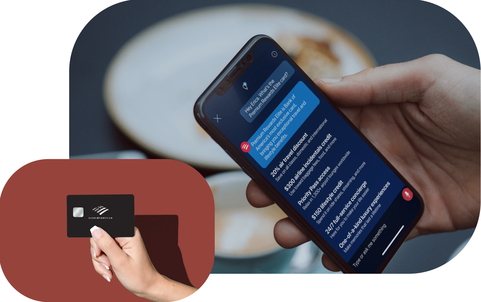
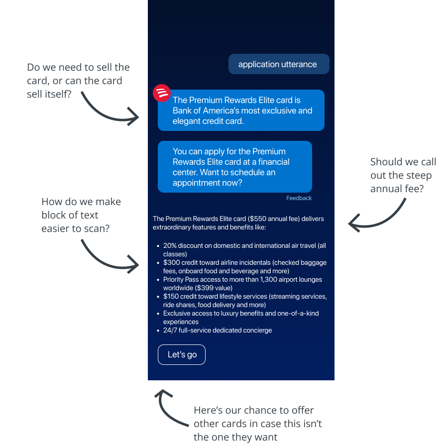
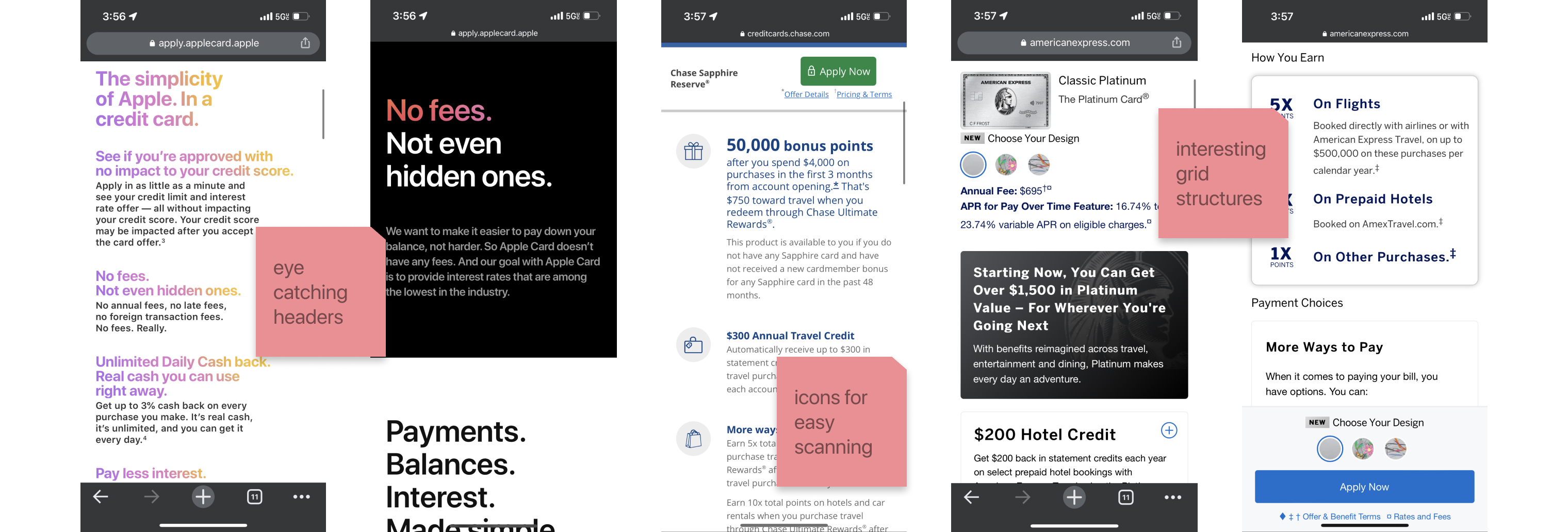
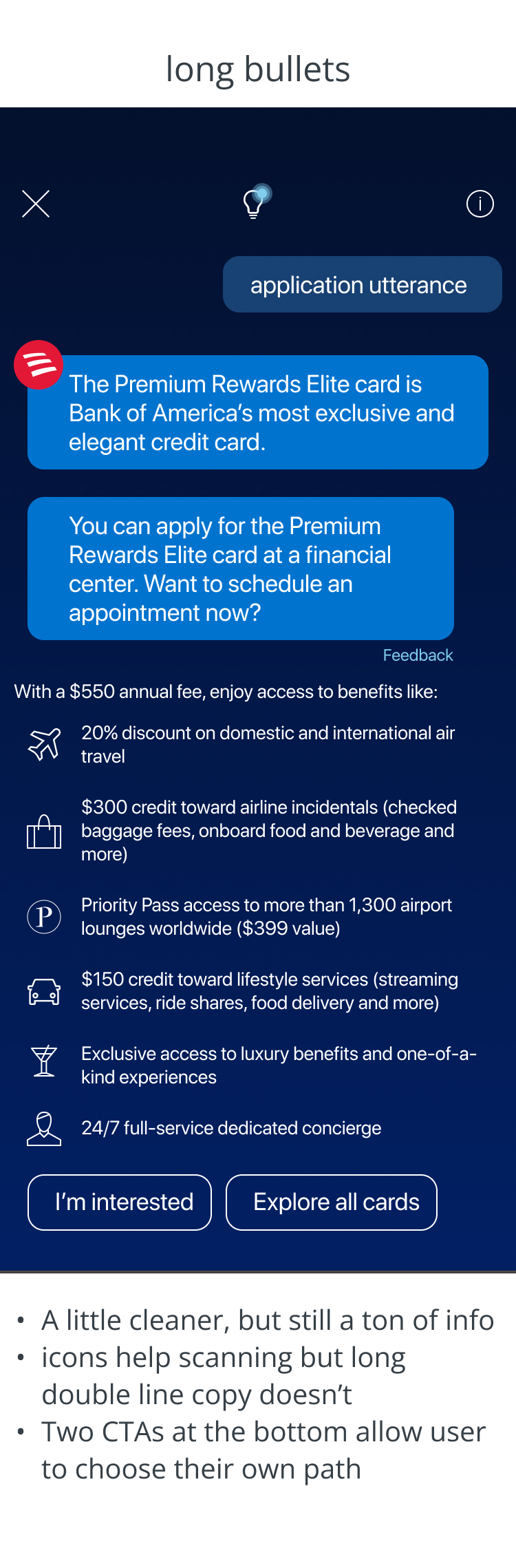
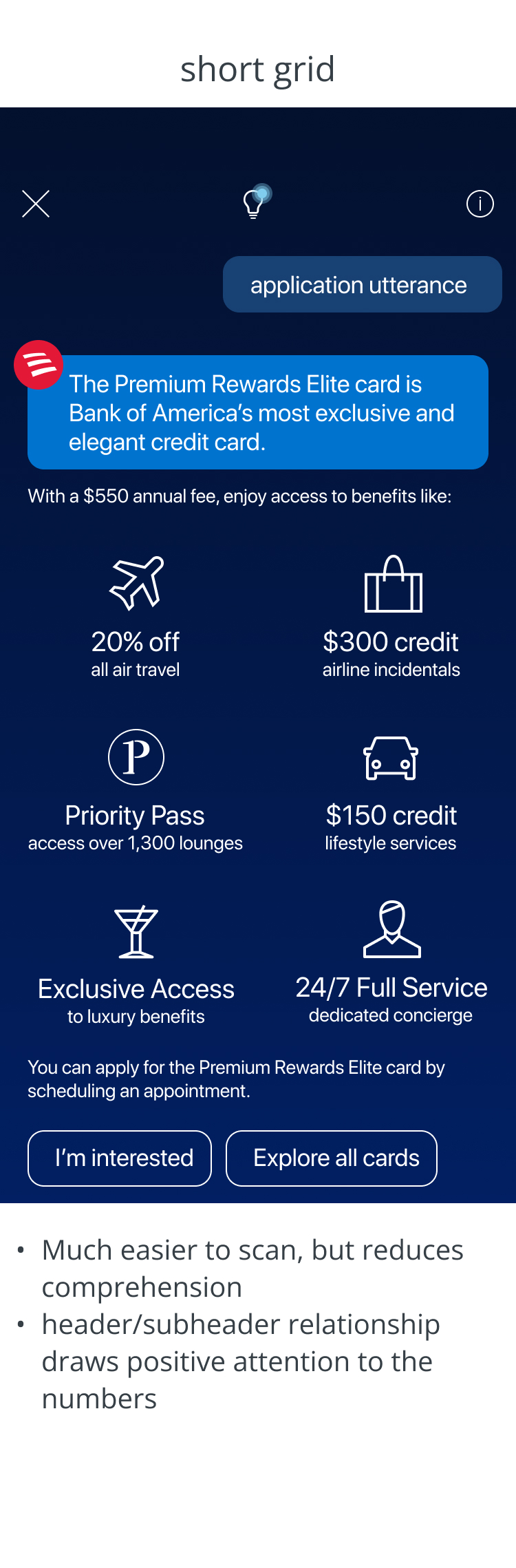
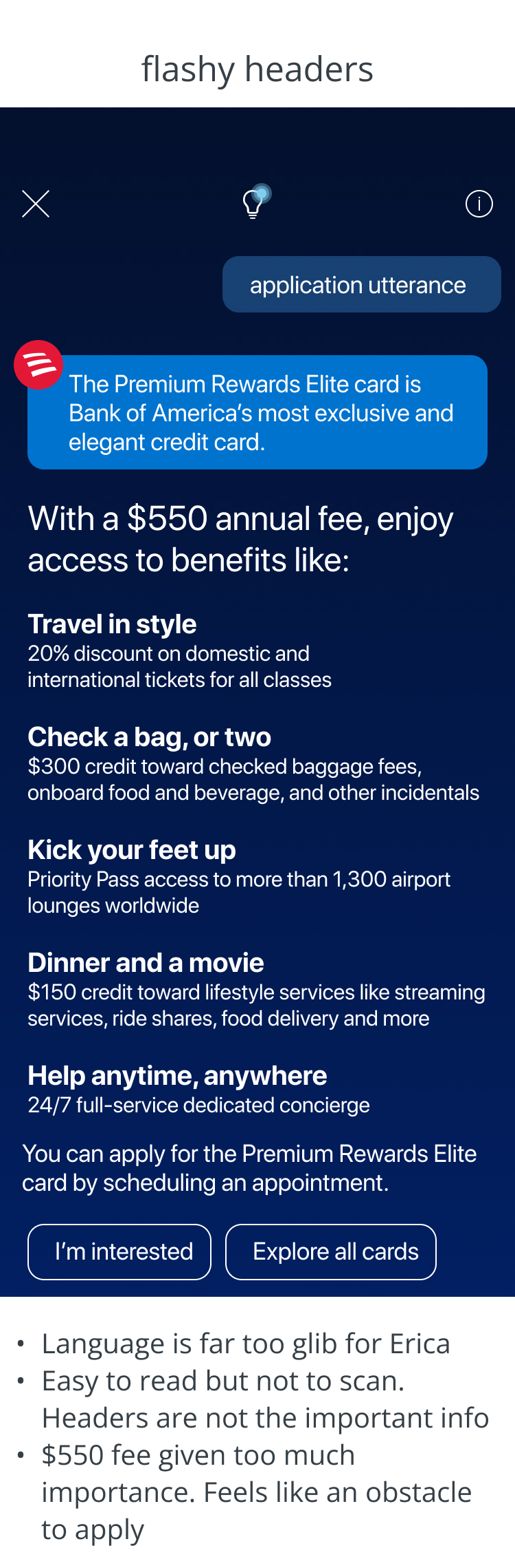
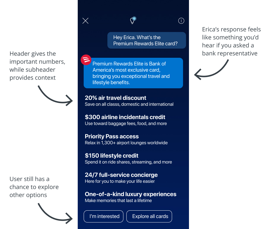
Travel credit cards pack a punch. We’ve all seen the beautiful, shiny credit cards that boast big benefits along with big fees. But as the user, it can be stressful and confusing to apply. BofA needed a way to guide users through all of the small print.
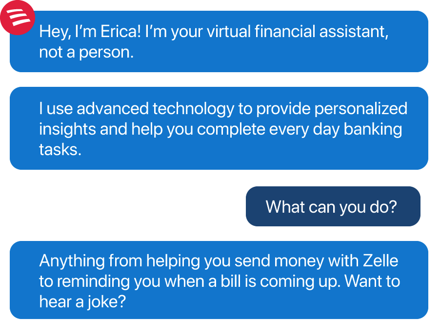
Erica, the bank’s financial digital assistant, would be the sole path to apply for a few months after release, and we were asked to create a response that would give users all the info they needed to apply.
When we release new features for Erica, we have to think of every possible way an user may ask a question, and every possible response Erica can give. As designer, I’m responsible for outlining that logic structure into flows, creating visuals for the conversational interface, and delivering this documentation to tech.
The premium travel card space is highly competitive and highly rewarding. People spend hours comparing credit cards from companies like Chase and American Eagle, hoping to get the best deal of points and perks for a steep annual fee. When we kicked off this feature, our pod focused on our users first. When they asked Erica for help with the Premium Rewards Elite card, what were they really saying? We narrowed this down to three personas:
I know I want a new elite card, but is this one better than the rest?
Maybe I want a new card? Can I get all the info first?
I defintely don’t want this card, but I’ll take a look at what else you got.
which helped us determine three objectives for the feature.
But exactly is the competition? What do the users need to know to push the Elite card to the top of their list?
American Express Platinum | Chase Sapphire Reserve | Premium Rewards Elite | |
---|---|---|---|
Annual Fee | $550 | $550 | $550 |
Welcome Bonus | 60k after spending 5k | 50k after spending 4k | 50k after spending 3k |
Earning Rate | 5 pts/$1 on Amex travel flights, hotels 1 pt /$1 evrything else |
3 pts/$1 dining and travel 1 pt/$1 on everything else |
2 pts/$1 dining and travel 1.5 pt/$1 on everything else |
Annual Credits | $200 airline incidentals, $200 Uber | $300 in travel, $120 Doordash | $300 airline incidentals, 20% off all flights, $150 misc |
The Premium Rewards card boasts pretty solid benefits, and these perks are multiplied for our Preferred Rewards customers. We can see the edge that our card has, and now know what information to focus on. But how do we present it?
This was the draft mockup I made after our kick off. This was all of the immediate info our marketing team wanted us to include, but I had a few concerns.
To understand how other companies handled the complicated typography around credit card deals on a mobile screen, I did a quick and easy competitive analysis.
I liked the idea of exploring with interesting typography, or experimenting with icons in a way we haven't tried with Erica yet. The benefit of a multi modal experience is that we can push the visual envelope sometimes, so I was able to develop three ideas to bring to our first round of design review.
The biggest takeaways I had from our design review was that we had to cut down on the words on copy, make it easy to scan quickly, and try to keep Erica friendly rather than a salesperson (salesrobot)?
And as much as I felt that the icons were an interesting path to explore, our tech teams let us know that it was out of scope for this feature. So, we focused on our third option and addressing the feedback.
And this made it through, and can be seen in production today. If you’d like to see the whole interaction, go ahead and ask your Erica on your Bank of America app.
This was a fun quick project to work on in Erica, and the first time we were seeing Erica try to market a product to our users. We wanted to keep Erica’s friendly and informative personality intact, but also fufill the strategy laid out by marketing. While this was a relatively simple feature to get through, I learned a few things through this process:
- It’s better to invite tech to the conversation early and often, so I didn’t spend too much time developing icons
- In conversational design, you’re always thinking about what the user is asking for. From that lens, we did a good job answering all aspects of that question and allowing the conversation to continue down a different path
- If I had more time, I’d love to explore interesting animations and illustrations